Lately we've been catching up with X-Men: Evolution via Netflix. This cartoon's a curious specimen; the high concept -- "It's the X-Men! And they're in high school!" -- sounds like the kind of thing a TV executive trying to appeal to The Young People would come up with after a three-martini lunch. But what could have been goofy instead has a charming earnestness to it, the character designs are stylized in a fun way, and the missteps (such as "Spyke," the lamest character ever) are outweighed by the good bits.
The DVDs, in lieu of commentaries, feature episode introductions by the creators of the series. Amusingly, they all look like they should be members of the Syracuse Chamber of Commerce, not animators. That greatly entertains me, for some reason, and I like the idea of these guys knowing what they're trying to do and working really, really hard to do it well.
Friday, June 30, 2006
Wednesday, June 28, 2006
The movie.
I liked it.
It wasn't Superman: The Movie, but what could be? Oddly, the very things that gave me pause prior to seeing the movie, and still make me wonder how the hell they could ever make a sequel to Superman Returns, are also the things I like. The temptation with this sort of a movie, I think, often is to do an impersonal, respectful take that hits the right notes but doesn't actually DO anything. But the weirder aspects of the movie -- and I'll steer clear of saying anything too spoilerish for now -- also make it a much more idiosyncratic and personal and affecting story. I'm not sure it works or holds together or makes a great deal of sense, but it's got its own point of view and perspective beneath the set pieces and special effects and that gives it a charge that it might otherwise have lacked. It reminds me more of something like Kurt Busiek's Superman: Secret Identity or one of the weird Elliot S! Maggin Superman annuals from the early 80s than a "normal" Superman story. And that's a good thing.
I say all of this as someone who was deeply, deeply skeptical of this movie all through the production process; most of the dribs and drabs of information we got were as likely to fill me with dread as anticipation. Nevertheless: I liked it, and I recommend it, and I recommend going in with an open mind.
The suit.
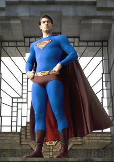
Like a lot of comics fans, I was underwhelmed by the first images of the Superman suit for the new movie. The collar was too high, the reds were too dark -- approaching brown in some shots from some angles -- the boots were needlessly fussy, the texture on the blue was weird, the seams were too big and too bold, the embossed, raised "S" wasn't right.
In still photos, all of these things are true.
In motion, on a big movie screen, the damn thing actually works, for the most part. The dark red isn't the stopping point it looks like in photos, the texture on the blue looks line, the seams fade away almost to nothing, and the "S" looks no more or less weird or wonky than, say, Gil Kane's stylised rendition as compared to something like Jerry Ordway's more mainline one.
The one early complaint that still holds is the belt buckle. For some reason, instead of leaving the belt alone, with the simple yellow oval buckle of the comics and previous movie costumes, the designers chose to replace it with a miniature version of the "S" logo.
It doesn't work. It's not awful, but it's distracting and silly and breaks up the look of the costume in a number of key scenes, mainly because the "holes" in the logo are colored red. If it were a solid yellow, it probably wouldn't matter, or even be much noticed, but as is it's a pretty weird costume element.
Still, given my early apprehensions, the suit was a very pleasant surprise.
28 Years Later
I'm pretty sure Superman: The Movie was the first movie I ever saw in a movie theater; if I'm wrong about that, I never want to be corrected. When it came out in 1978, I was three. I don't remember a single thing about seeing the movie that first time, except that when I got home I started running around in my Superman underoos (eventually my grandmother to made me a red cape with an "S" to go with it). Since then, I've seen the movie at least a hundred times on TV or video, which is not so awful when you break that down over thirty years. So you could say I've seen it a lot, and could hum the theme music by John Williams more or less in my sleep.
And, boy, is that theme about as close to perfect as any movie music has ever been.
And last night, sitting in the weird multiplex in the middle of nowhere, hearing that theme used again in the opening sequence of the new movie in a darkened theatre in full surround sound, I felt goosebumps that I didn't even know I had. I felt like that little kid who didn't quite get that Superman: The Movie wasn't a documentary -- hell, I'm STILL not quite convinced of that -- all over again.
As I've said: Best. Wife. Ever.
What makes someone the Best Wife Ever? Stuff like this:
Last night at 9:41 pm I remembered that there were 10pm screenings of Superman Returns. It was far too late to try to make even the closest theatre to our house.
So Best Wife Ever, a.k.a. She Who Must Be Obeyed, decided that going to a late premiere on a weeknight was the kind of thing we don't do enough of anymore since we got older and less irresponsible got online and found an 11 pm screening at a weird multiplex in the middle of nowhere and we hopped in the car and saw the movie.
More about which later.
But for now: Best. Wife. Ever.
Thursday, June 22, 2006
I am shocked, yes, SHOCKED!
My faith in HGTV has been shaken to its core by this first-hand account of what it's really like to go on the inaptly named FreeStyle:
The show's premise is that you can redecorate a room and solve all of your design problems absolutely free . By simply rearranging existing furniture, bringing in overlooked treasures from other rooms and getting rid of whatever is deemed unnecessary (and unattractive), anyone can create a photo-worthy habitat. The idea was even cheaper than yet another HGTV hit, "Design on a Dime." In my case, according to the HGTV Web site, designers would pull off "a dramatic new look without spending a dime!"
Well, okay, so maybe a dime. During the audition phase, the producer allowed as how the reality show really does budget $200 or so to spend on each apartment. I promised not to mention this during my fleeting appearances on camera.
One other thing: Prior to giving me the green light, the same producer confirmed with me several times that I would be willing to spend my own money on an additional piece of furniture of the designer's choosing. It seemed that absolutely free would be an abstract notion from the get-go.
[...]
I learned a few design tricks as the day progressed. For instance, books are primarily visual props, not meant for reference or reading. They should be placed in random horizontal, vertical and diagonal patterns in a bookcase for maximum visual stimulation. Forget genre; books should be arranged strictly by size. Every table should have two or three books of bright colors "carelessly" lying on it, along with an empty knickknack box and a mini bouquet of fresh roses.
In the end, I hated it. The room was double-stuffed with furniture, leaving almost no floor space left to walk on. Every other room of the apartment was nearly empty. Apparently, the designer had something against fireplaces and bay windows, the very features that led me to rent the place, because she hid one behind the daybed and the other behind a sofa. But she was pleased with the result: more seating for Washington-style entertaining.
After the cameras stopped rolling at 10:30 p.m., my sense of self and voice returned. I asked the burly guys to move half the furniture out of the living room and back to where I actually needed it. While the decorator pouted, adorable cameraman Andy helped me move everything around and came up with a final design that I liked. Alas, the real interior design will never be on the air.
Wednesday, June 21, 2006
Targeted advertising
Ever since I read Wired's article about the guys trying to reverse engineer Netflix so they can use it for porn, I've been paying more attention to the packaging our movies arrive in. Netflix has been selling ad space on the inside of the detachable flap on its envelopes for a while, but today I noticed that the ads seemed to be tailored to the movies they came with. X-Men: Evolution got a Superman Returns ad, while Scrubs came with an ad for Adam Sandler's upcoming movie. Not the sharpest targeting, but still interesting to note. Perhaps the porn guys will also notice, and put this principle to use...
Re: Action Comics
I don't have the time to do a rundown of DC's September offerings (Short version: Yay for All-Star Superman and Showcase Presents: Phantom Stranger). But I do want to point out a near almost-homage. That month's issue of Action Comics, #843 for those of you keeping track, sports this Dave Gibbons cover:
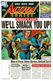
And I can't help but wonder if it's a shout-out to this much, much older cover from Action Comics #52:
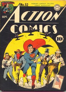
That cover jumped out at me years ago, when I bought a small book reprinting the covers of the first 300 issues of Action Comics. I always thought it would have been cool to revisit it as a cover during the Reign of the Supermen storyarc, when there were four would-be replacement Supermen running around the comics. In this case, there's not much similarity between the comics beyond the general concept of "Superman and allies run toward the reader" but it's still neat.
And it's fun to see the inclusion of Busiek's revamped Aquaman and Skyrocket, late of Power Company, included as well; I for one welcome nepotistic continuity when it involves creators I like.

And I can't help but wonder if it's a shout-out to this much, much older cover from Action Comics #52:

That cover jumped out at me years ago, when I bought a small book reprinting the covers of the first 300 issues of Action Comics. I always thought it would have been cool to revisit it as a cover during the Reign of the Supermen storyarc, when there were four would-be replacement Supermen running around the comics. In this case, there's not much similarity between the comics beyond the general concept of "Superman and allies run toward the reader" but it's still neat.
And it's fun to see the inclusion of Busiek's revamped Aquaman and Skyrocket, late of Power Company, included as well; I for one welcome nepotistic continuity when it involves creators I like.
Sunday, June 18, 2006
"I'll take 'More time than I have ever had on my hands' for $800, Alex."
That's what it would take for me to do something like this incredibly elaborate Doctor Octopus costume.
Sunday, June 11, 2006
House
Earlier tonight USA showed the pilot episode of House. I hadn't seen it since it first aired two years ago, so I watched a few minutes. What was striking about it was how different the pilot was shot; it was, basically, a black and white with various shades of orange and brown show. I'd completely forgotten that, and now I'm curious to see whether the shift to more naturalistic filming took place immediately afterward or as the first season progressed.
It was also striking to see Jennifer Morrison not look like she'd snap in twain if a stiff wind caught her at the proper angle. Why do these actresses emaciate themselves like that? It's just plain depressing.
It was also striking to see Jennifer Morrison not look like she'd snap in twain if a stiff wind caught her at the proper angle. Why do these actresses emaciate themselves like that? It's just plain depressing.
Friday, June 09, 2006
Three-word review of Comedy Central's DOG BITES MAN
Monday, June 05, 2006
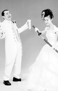
You can bring props? If I'd known that we would have had props too.
I present to you, this Monday morning, what may be the best wedding picture ever by way of my hometown newspaper:

Sunday, June 04, 2006
Thursday, June 01, 2006
Exit Farina
Via TV Tattle (look, indispensible is indispensible, all right?) comes the welcome news that Dennis Farina is leaving Law & Order after two seasons. The news is welcome because, while he's a fine actor and I've enjoyed him in other places ranging from Manhunter to Justice League
 , he just never clicked on L&O or came anywhere close to filling Jerry Orbach's formidable shoes. He had very little to work with, character-wise, and more often than not his Det. Fontana was simply written as a bully.
As for a replacement, I suggest that Dick Wolf move Richard Belzer over from SUV to the mothership -- which would be rather fitting since we learned during a L&0/Homicide crossover that Lennie Briscoe once dated one of Munch's ex-wives...
As for a replacement, I suggest that Dick Wolf move Richard Belzer over from SUV to the mothership -- which would be rather fitting since we learned during a L&0/Homicide crossover that Lennie Briscoe once dated one of Munch's ex-wives...
Subscribe to:
Posts (Atom)
